Behind-the-scenes: from Album design to album
AS we had a preliminary talk with the artist before the photo shooting for the album, we can continue directly with our work. This is clearly an advantage of the "from a single source" principle. A deeper look at the photos is necessary and it is helpful to show the artist his photos personally to find out which he likes and which he could imagine as an album cover. It is helpful if the artist does not get the photos in advance by e-mail or, in the worst case, by WhatsApp, because WhatsApp compresses images and therefore the quality suffers due to the transfer of the image. Show the pictures to the artist in the best possible quality on the specially brought, before tested and loaded tablet. That happens behind-the-scenes a lot of what the artist wants and how you fulfill that vision with your technical and graphic knowledge and photography skills.
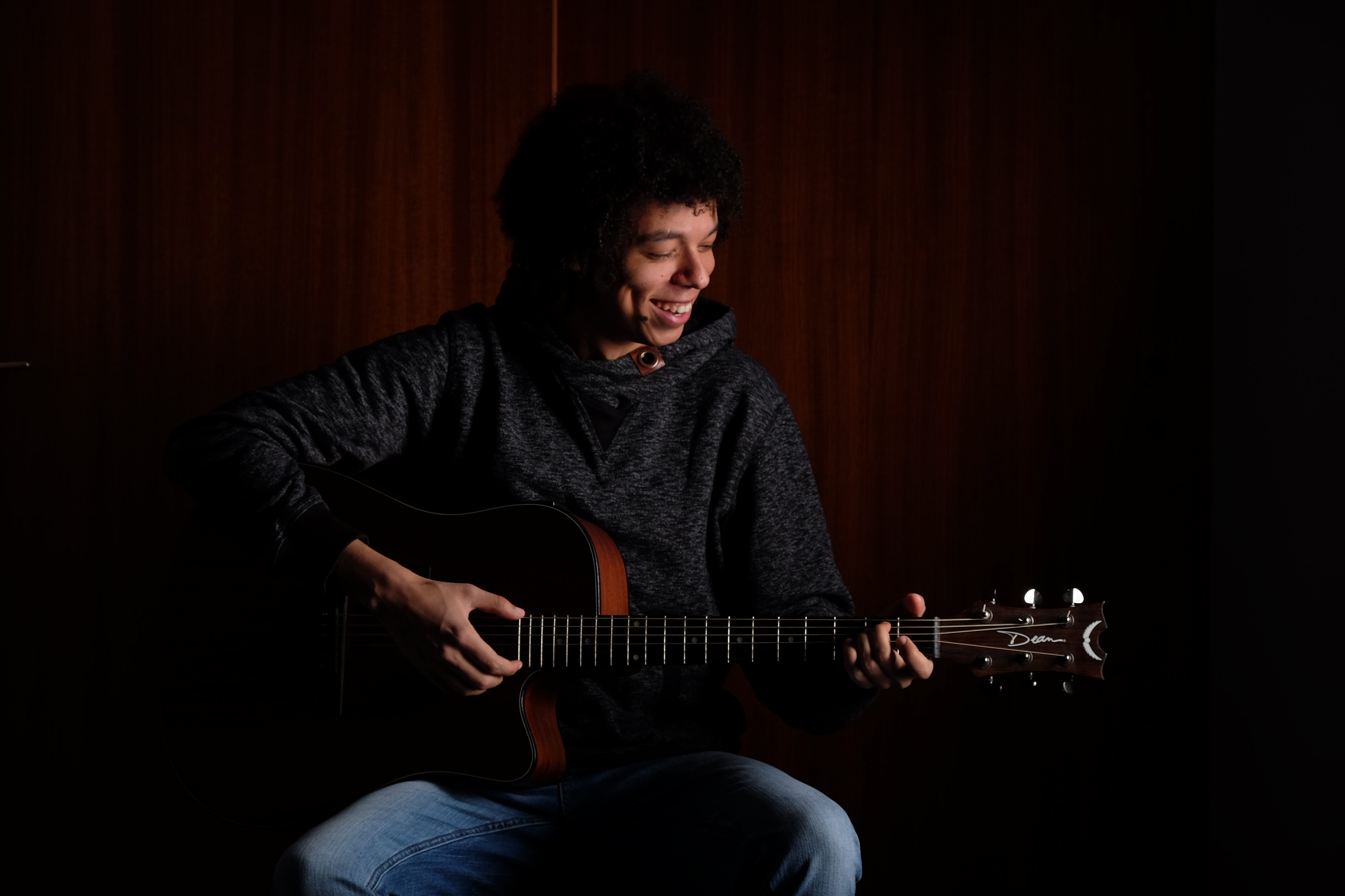
For an appropriate choice the type of album is of importance, but also general aspects of the design must not be disregarded - this contradicts itself? Yes - it should be. The album should look as it is intended by the artist, should please him, encourage customers to buy, address the future customers and also realize their own ideas of an album, which they imagine than an album of such a music genre should be like and yet do not get lost in the stream of the mass of albums. In other words, everyone should like it. But how do you make the artist and the unknown mass of buyers like it? It is helpful to know the "laws" and aids of design, such as the Golden Spiral or the Golden Section, and use these as arguments against some of the crudest of artist's ideas. To clarify that I show in advance in comparison four image bases for a cover, which I have selected from the set of images.

A possible cover for Memories (Photo: F. Pratzner)
- Camera:
- Fuji X-T1
- Aperture:
- f/6.4
- Exposure:
- 1/125 sec. .
- Focal length:
- 55 mm
- ISO:
- 200

The unedited photo from the album cover Memories (Photo: F. Pratzner)
- Camera:
- Fuji X-T1
- Aperture:
- f/6.4
- Exposure:
- 1/125 sec. .
- Focal length:
- 55 mm
- ISO:
- 200

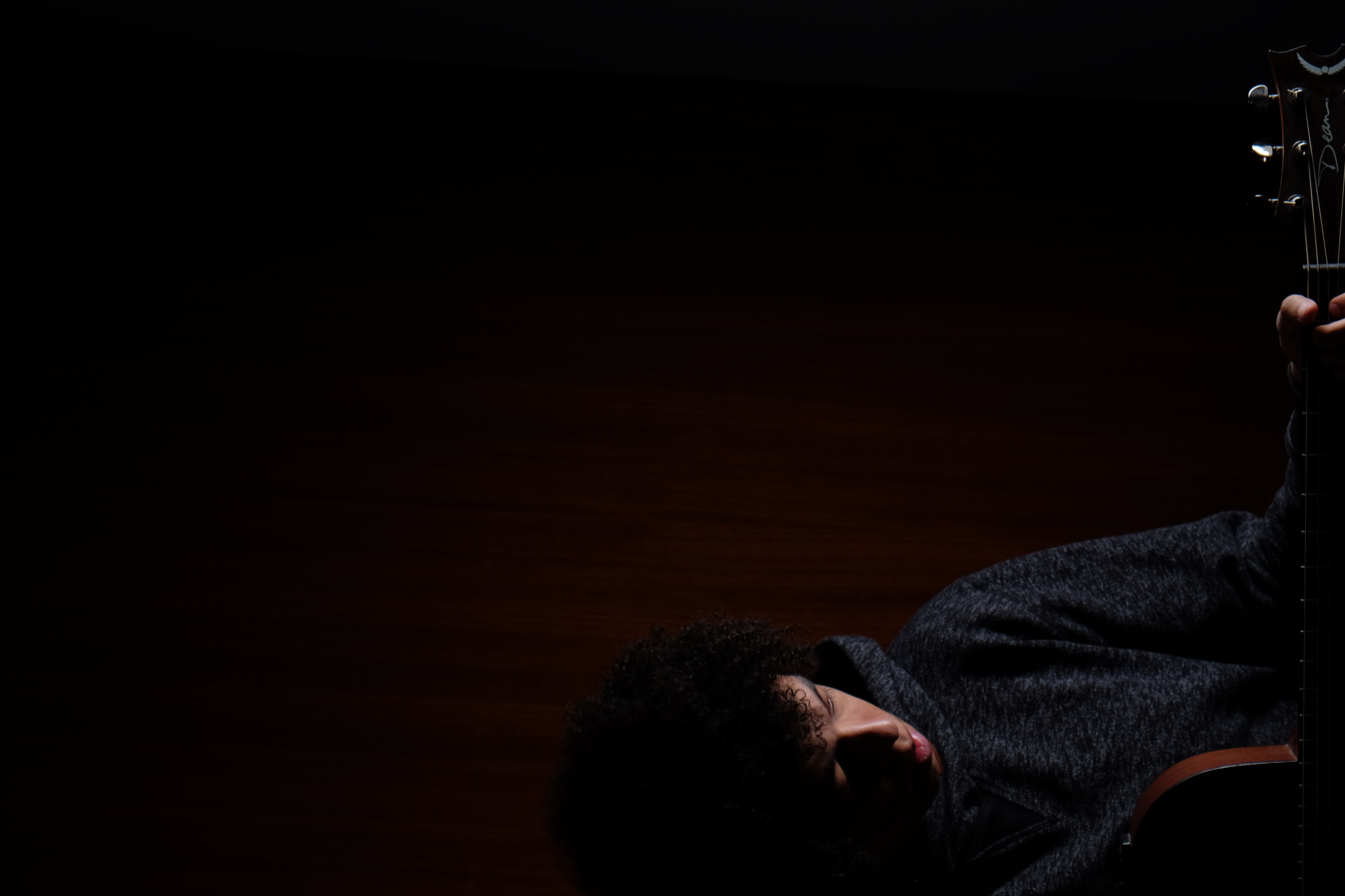
The possible cover with Mike Coustic looking down (Photo: F. Pratzner)
- Camera:
- Fuji X-T1
- Aperture:
- f/6.4
- Exposure:
- 1/125 sec. .
- Focal length:
- 55 mm
- ISO:
- 200

A possible cover showing rocking Mike Coustic (Photo: F. Pratzner)
- Camera:
- Fuji X-T1
- Aperture:
- f/6.4
- Exposure:
- 1/125 sec. .
- Focal length:
- 55 mm
- ISO:
- 200
The basics of a cover
Now, with four good bases for a cover, we take a look at the individual pictures that are suitable as covers. How do they work as covers? Where would you place the font of the album "Memories Mike Coustic"?
In the first picture, the artist's gaze shows the way. It basically directs the viewer to the upper right corner. A good place for the writing, the first look upwards makes the artist seem thoughtful. A credible picture that the artist is currently reminiscing about memories.
The second photo is characterized by a charming smile and a lowered view towards the guitar. It seems as if the artist enjoys playing, even if we can recognize by his pin sharp hands in the picture that he "only" poses. Nevertheless, it looks honest and open and could you not buy an album on which the artist shows so much joy in playing? The writing can stand anywhere on the right and also works through the large dark surface.
The third photo forms the stark contrast to this, the serious features in combination with the almost self-contained posture without body tension gives the viewer a completely different idea of the album. Memories can also be sad and thoughtful and accordingly will be the buyer group of this album. Considerations for the font should be adapted to the style.
Here, the fourth photo shows a different direction and radiates energy, simply termed a "I will rock you" feeling. Unfortunately, this feeling often has little to do with memories and does not hit the kind of album the artist wants. Maybe we'll see it as the cover of a future Mike Coustic album.
The selection of the cover
In view of the three possibilities it is worth listening to the music completely in order to be able to make an appropriate decision. Although there was a sad song on the CD, a life-affirming basic tenor that is emphasized with fast chords and a powerful voice prevails on the CD. Accordingly, a clear picture emerges in favor of the second photo. A cut to the appropriate dimensions quickly creates clarity how the finished EP would look. It is also worth inserting a suitable font including text to be able to carry at least one placeholder. But enough theoretical, here a little task: Do you find the 3 image errors or do we say impairments I have removed from the picture?

Mike Coustic Albumcover Memories (Photo: F. Pratzner)
- Camera:
- Fuji X-T1
- Aperture:
- f/6.4
- Exposure:
- 1/125 sec. .
- Focal length:
- 55 mm
- ISO:
- 200
The flaws are the blue pants and the gigantic brown button under the chin. The trousers were removed by selecting the section on the cover while the button needed some image editing. The third mistake with the overlapping wooden doors also requires image processing, but this is the small price of some good ideas. Small mistakes, but a few minutes of work.
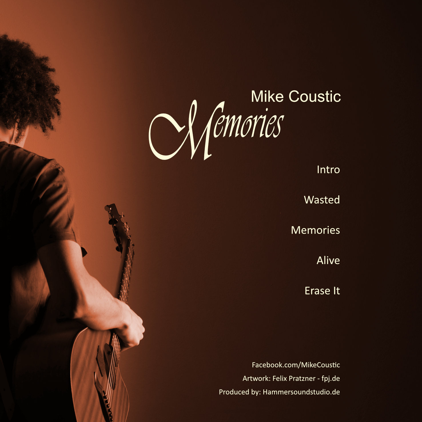
The back print and the CD print
The back of a music CD also needs printing and the CD itself needs printing. What is important is what is wanted. Linear printing, i.e. a small text about the album, and a track list or only one of both. It would be important to adhere to the dimensions of a CD and to print on legal bases, which many resellers require in order to be able to sell their works there. I advise everyone to sell it on their own website and to have it professionally created at best. After all, it is their most prestigious business card. It is important to keep a uniform art style for the album, so to speak a corporate design, and to incorporate good ideas of the artist. Important is to take a color for the art style, that is in the album cover. The colour for the corporate design was one of the colours of the living room doors. Those photos are not that important, and some even leave the CD blank, but why? It is your, the artists, CD and deserves and unique overlapping style over the whole album.

Mike Coustic Album Backside Memories (Photo: F. Pratzner)
- Camera:
- Fuji X-T1
- Aperture:
- f/6.4
- Exposure:
- 1/125 sec. .
- Focal length:
- 55 mm
- ISO:
- 200
For the back of the cover this photo was chosen to give the whole thing a sad, averted dimension, as already observed in the third picture base.

Mike Coustic Album Offsetprint Memories (Photo: F. Pratzner)
- Camera:
- Fuji X-T1
- Aperture:
- f/6.4
- Exposure:
- 1/125 sec. .
- Focal length:
- 55 mm
- ISO:
- 200
The offset printing of CD memories is almost a classic. It's really almost no magic to take a picture of a guitar and cut it to fit the hole in the CD. Nevertheless, as long as it corresponds to the style of the album and the artist and he himself has wished for a classical design, it fits here aptly.
The next part of our three-part series is about event photography for Mike Coustic's appearance. If you want to delve deeper into the elements of image composition, then take a look at the section of our course on the Golden Spiral and the Golden Cut.
If you are interested in a shooting or the artwork for your album send me an e-mail.